BRAND PREMISE // 2020
LOGO DESIGN
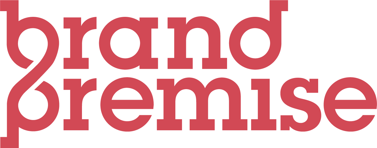
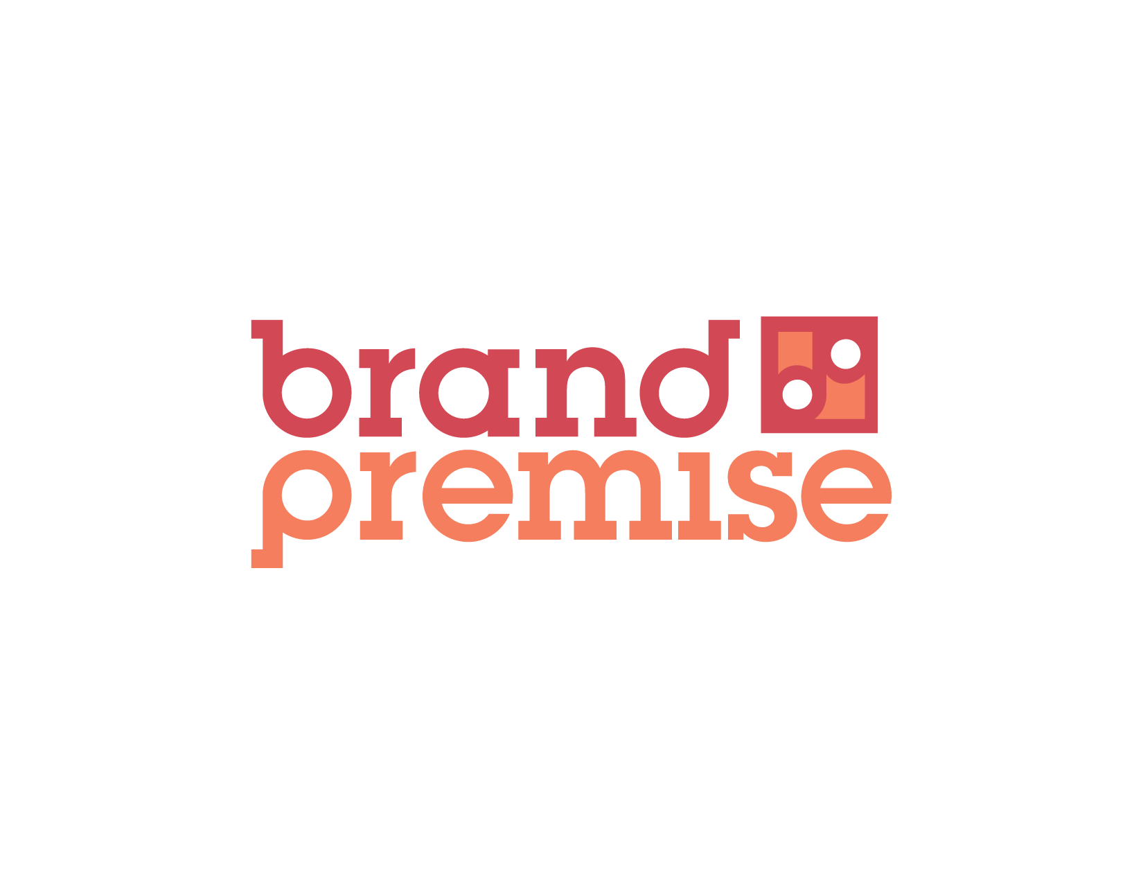
A refreshed logo for Brand Premise that redefined their identity—one focused on connection. The final logo mark features custom typography with intertwined B&P letterforms representing cohesion and the path to creative resolution and revolution. Using energetic coral-reds the (first) option proved most effective, while other options explored helped the client identify what connections made the most sense to illustrate.
concepts
Here are a few other ideas considered.
INSIGHTFUL MOMENT
Designing logos for a design agency can be tricky. The logo had to connect with the founder while making the concept of location, direction, and connection understandable to clients. The logo was thankfully edited to be one color only later in the life cycle, because a ‘brand’ should never be at odds with its ‘premise.’
……….


